Ajay Shah in conversation with Experimental Jetset, an Amsterdam-based graphic design collective, founded by Marieke Stolk, Erwin Brinkers and Danny van den Dungen.
What’s a typical work day in the studio like?
The projects we are working on are always so completely different from each other – there are simply no ‘typical days’ in the studio. The only thing that always remains the same is our way of transportation to and from the studio – we often walk. Walking the streets of Amsterdam has become an important part of our practice – while walking, we intuitively reflect on the way in which language manifests itself in the city (and vice versa). This relationship, between language and the city, is still one of the main themes in our work. And walking is still the best way to explore this theme. To speak with Guy Debord (as quoted in Michèle Bernstein’s ‘All the King’s Horses’, from 1960): “I walk. Mostly I walk”… So our daily stroll to the studio is the only thing that’s fixed. But what happens in the studio is always different, and ever-changing.
How would you describe your work?
We sometimes describe our practice as “turning language into objects” – but we guess it can also be seen as the opposite, “turning objects into language”... In our work, we usually explore the relationship between language and the built environment. By creating objects that emphasize their own materiality, their own context, their own ’thingness’, we try to emphasize the fact that we live in an environment that is constructed, that is made by people, and thus can also be changed (and thus unmade) by people. We ultimately hope that’s an hopeful, empowering gesture. Nothing around us is (essentially) fixed – things always have the (existential) potential to change. As humans, we are shaped by our material surroundings – so in turn, we have to shape those surroundings ourselves. We want to create objects that somehow reflect on this dialectic – the relationship between making and being made.
How do you choose your collaborations? What made you say yes to Rubberband?
Choosing collaborations is always a very haphazard operation – a strange combination of random timing, gut instinct, and pure luck. We aren’t very strategic or opportunistic when it comes to the choices that we make – we often just stumble from one project into another, for better or worse. Regarding Rubberband – when Rubberband contacted us, they initially invited us to design a series of notebooks. We checked out their website, and noticed that they were also producing furniture – which we thought was quite interesting, as we like the idea of notebooks being an extension of furniture, or perhaps even a form of furniture in itself. (Again, this really connects to some of our main themes: language being an extension of the built environment, and the built environment being an extension of language). In fact, when we began working on the Rubberband project, we originally started by designing a typology of spatial objects – a series of small geometric sculptures, consisting of folded metal sheets (and if everything goes according to plan, these ‘Folded Objects’ will be released by Rubberband later in the future). The design of the notebooks just flowed quite naturally from sketching these ‘Folded Objects’ – they are both part of the same family of shapes.

 Small selection of early sketches and models, created in August 2018
Can you tell about the Four Letter Notebook Series concept?
When thinking about stationery as an extension of the built environment, we immediately had to think about the corporate surroundings of offices, and the specific language that is being used in that particular ‘graphosphere' – the language of memos, faxes, post-it notes, letterheads, business cards, xerox machines, type writers, tipp-ex fluids, carbon copies, word documents, spread sheets, bullet points, annual reports, etc. Somehow, we wanted to refer to this desktop language. And we figured that the format of the ‘four-letter word’ would make an interesting platform for exactly this corporate language. After all, in English, the term ‘four-letter word’ often refers to words that are offensive, profane, or subversive. So we thought it would be fascinating to let this two linguistic worlds collide, to let them clash: the language of the corporate ‘graphosphere’, and the format of the four-letter obscenity. Apart from that, we also created the series in such a way that the notebooks together form an alphabet – a sequence of 26 letters. A very direct way to turn objects into language.
How did you arrive at the colour system for the notebooks?
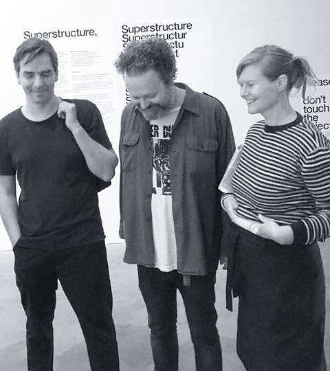
In our work, we usually prefer to use black-and-white. After all, back-and-white is very ‘archetypical' for printed matter – the most direct expression of ink-on-paper, the highest possible contrast between light and darkness, between thingness and nothingness. It’s also easiest (and cheapest) to reproduce, so it has a certain sense of economy, of material efficiency. It has a sense of punk minimalism – and we like that. We are always a bit wary of using colours. We feel that colours are often used to create a certain atmosphere, a certain mood – and we never have been really interested in the idea of creating atmospheric moods. We’d rather ruin the mood, so to speak. However – there are indeed cases in which we've used colours. Sometimes we used them to create certain 'colour codes' (for example, in our 2018 exhibition 'Superstructure', we used four different colours to differentiate between four different time periods). Sometimes we used colours to consciously refer to early-modernist tendencies (movements such as De Stijl and Bauhaus). Other times we used colours to refer to flags, or to icons, or to reproduction techniques (RGB, CMYK), or to all kinds of other themes and subjects. In the case of the ‘Four Letter Word’ series, we used the colours to add a certain spatial dimension to the notebooks – to emphasize their construction. We used harsh, hard primary colours, placed next to each other, to create a certain optical effect – as if the notebooks are folding and unfolding themselves through the sheer power of radiancy. It’s almost a radioactive reaction – twisting the optic nerve.
 Selection of ‘Four Letter Word’ notebooks, printed in 2019
Having said that, there’s also a sort of ‘colour code’ going on. The series consist of 26 notebooks: one-third of the notebooks are black-and-white, another third of the notebooks are monochrome (i.e. printed in only one colour), and a final third of the notebooks consist of two clashing colours. So the colours also serve as a way to break up the alphabet in three equal parts,
What's your favourite four-letter word?
We've never really thought about four-letter words in such a way – the idea of having a favourite word simply never occurred to us! Come to think of it, we think that the word FOUR is quite an interesting four-letter word. It means four, while consisting of four letters – so it has a certain hermetic beauty. It’s like a little machine, generating its own meaning – a bubble of logic. However, the word FIVE comes to mind as well, because it’s a little machine that destroys logic – it means five, but consists of four letters. So it contains a certain absurdist nihilism – which makes it very beautiful to us as well.
Which is your favourite poster?
One of our favourite posters might be the ‘March 10 – Day of Anarchy’ pamphlet, designed in 1966 by the Dutch Provo-affiliated illustrator Willem (Bernard Willem Holtrop). It has always been a source of inspiration for us.  ‘March 10 – Day of Anarchy’, Bernard Willem Holtrop, 1966
The design (announcing a protest march) is sharp and clear, but also contains a contrarian element: the mirrored A. This mirrored letter obviously symbolizes the idea of anarchism – but to us, it also refers to the notion of printing itself.
After all, most methods of printing involve images that are either mirrored, upside-down or negative. So for us, this poster also represents the contrarian nature of printed matter itself – the idea that you need a negative to get something positive.
What do you look forward to designing next?
We’re looking forward to finishing the graphic language that we are currently developing for V–A–C a Moscow-based art institute. It’s quite a layered, complicated project, as V–A–C consists of several branches (GES-2, Zattere, The Vaults, etc.), located in several cities (Moscow, Venice, London).
To represent this institute (and all its internal and external relationships), we came up with a ‘diagrammatic’ language – a sort of ever-changing typology of diagrams, mapping all activities that take place within V–A–C.

‘Discovering GES-2’, rough animated sketch for V–A–C, 2018
It’s a huge collaborative project, consisting of printed matter, websites, sign systems, etc. – we’ve been working on it already since 2017, and it won't be fully ready until 2020, when GES-2 (the main location of V–A–C, designed by Renzo Piano) will open in Moscow.So until 2020, we will be totally occupied with this project – and we’re looking forward finishing it, and seeing it fully realized in the city center of Moscow.